
Lapoya Font
Original price was: 17,00 $.12,99 $Current price is: 12,99 $.
About
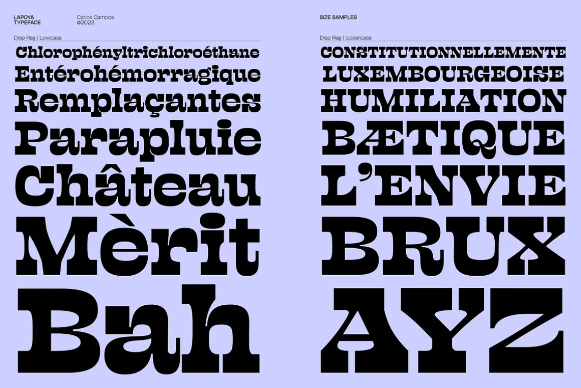
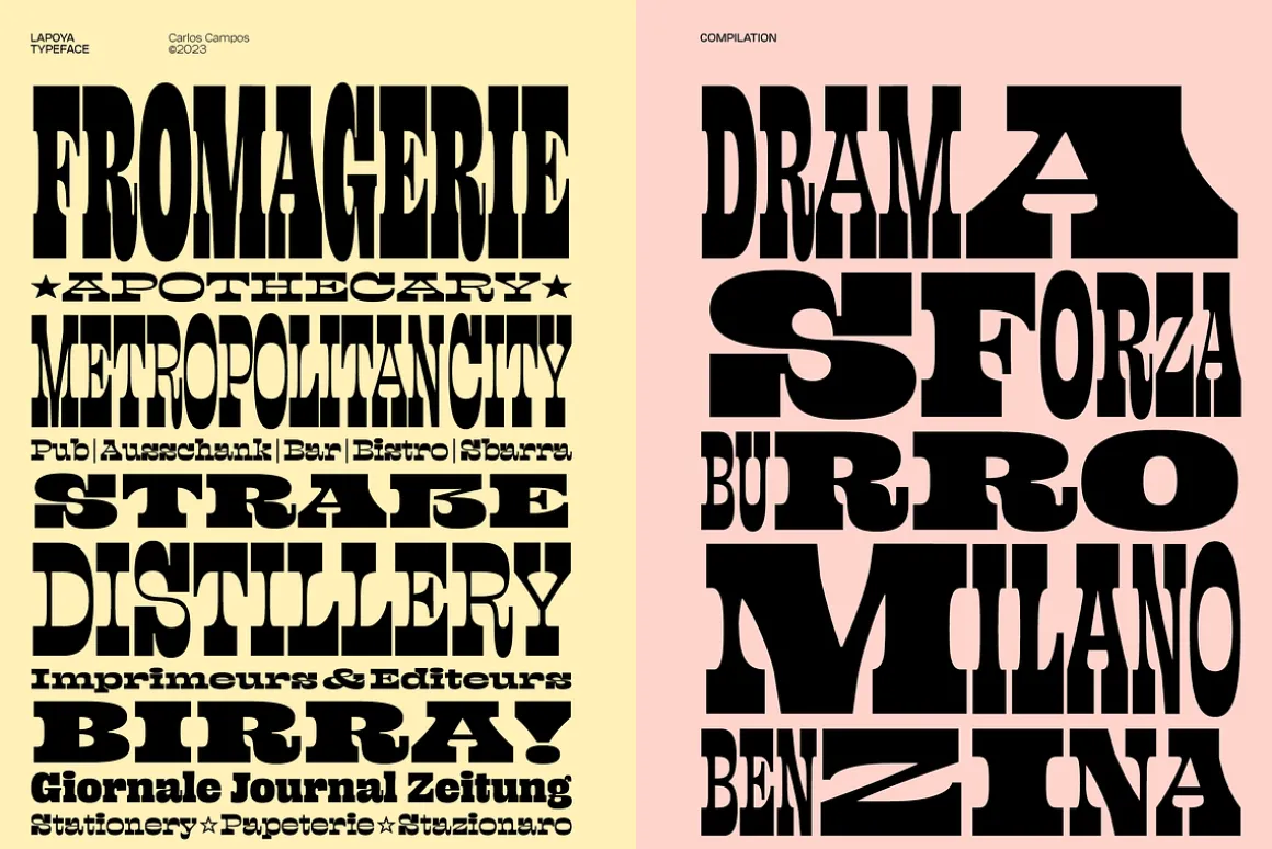
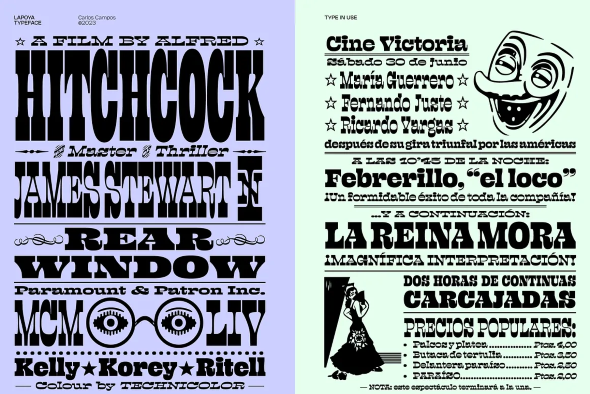
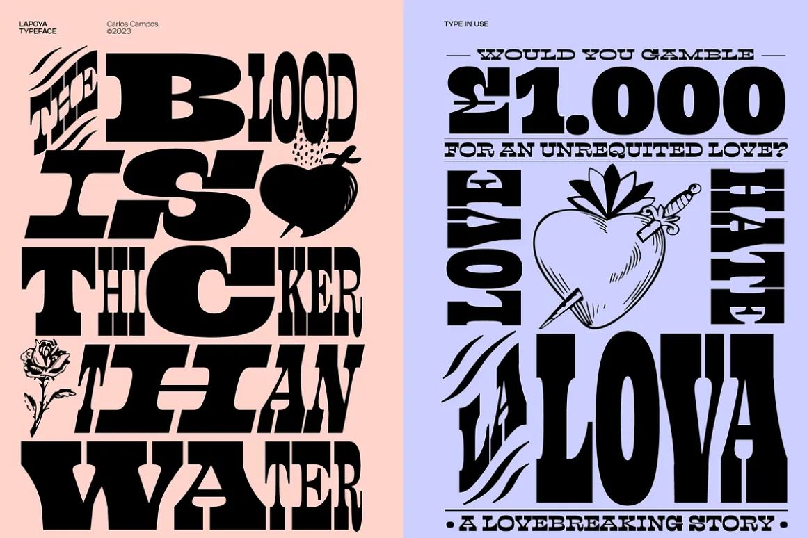
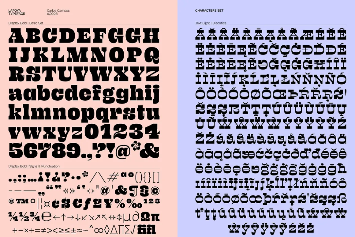
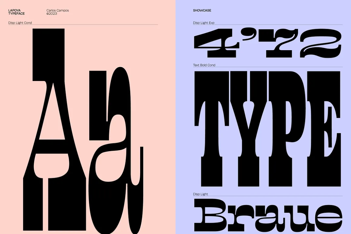
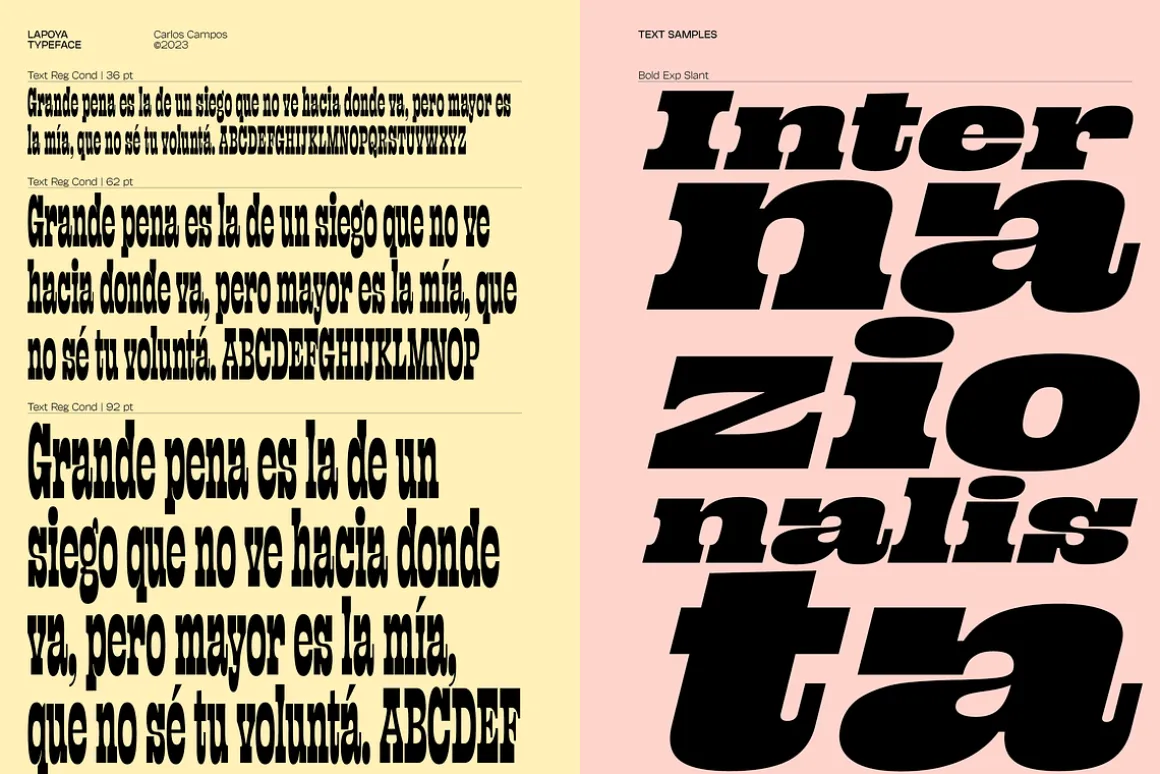
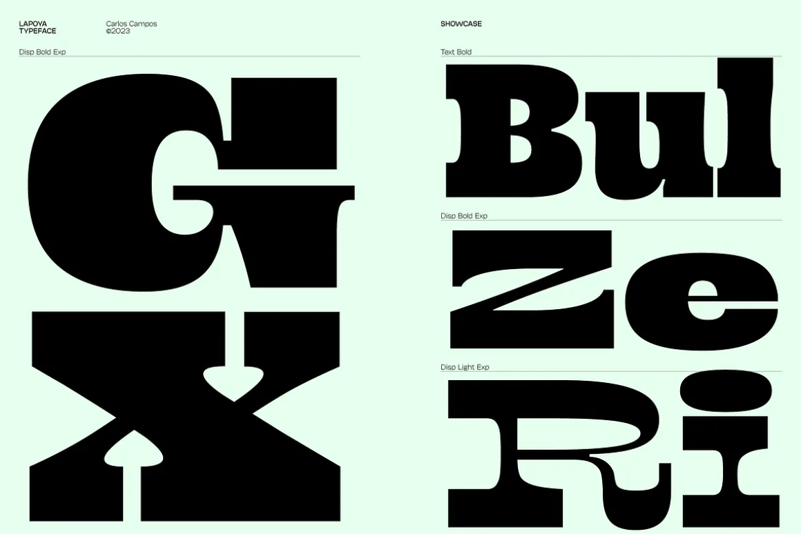
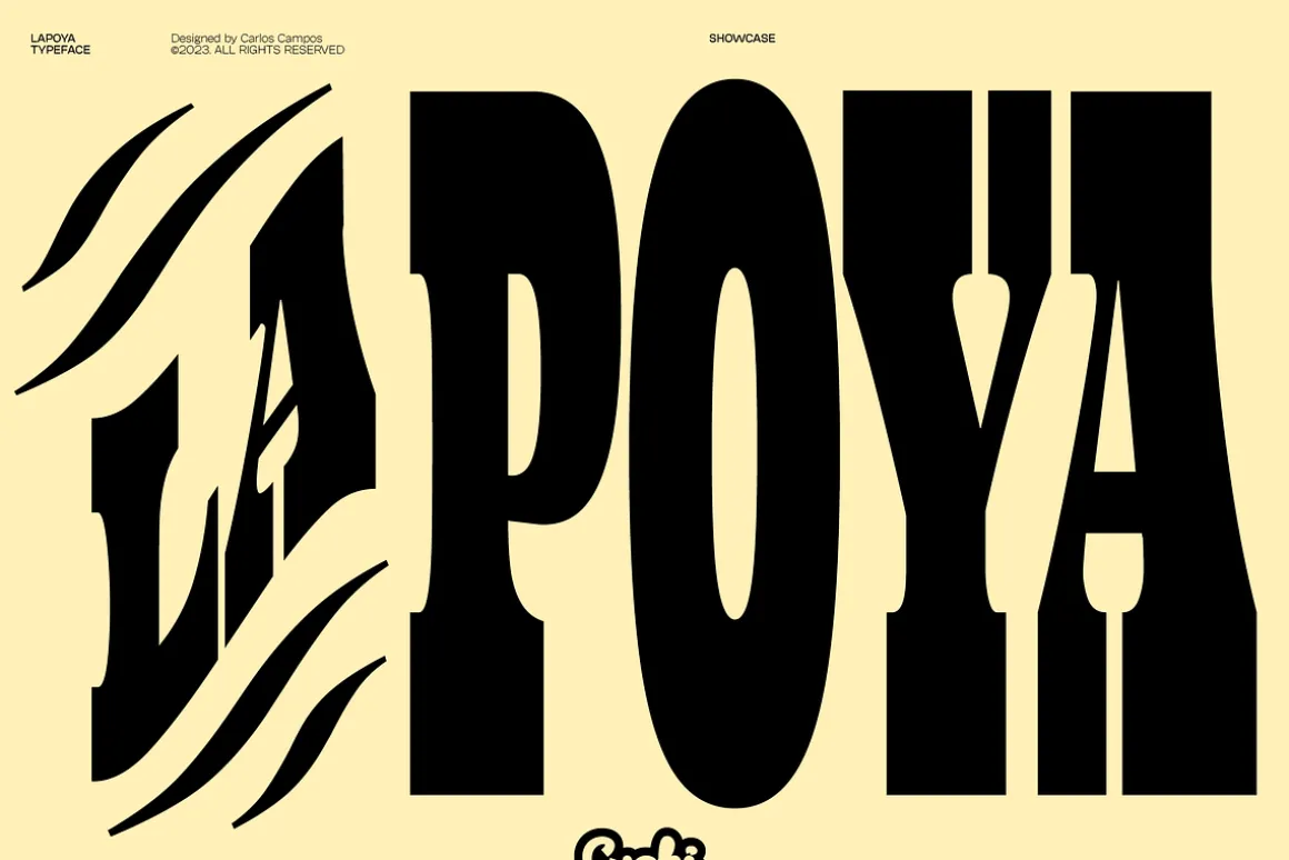
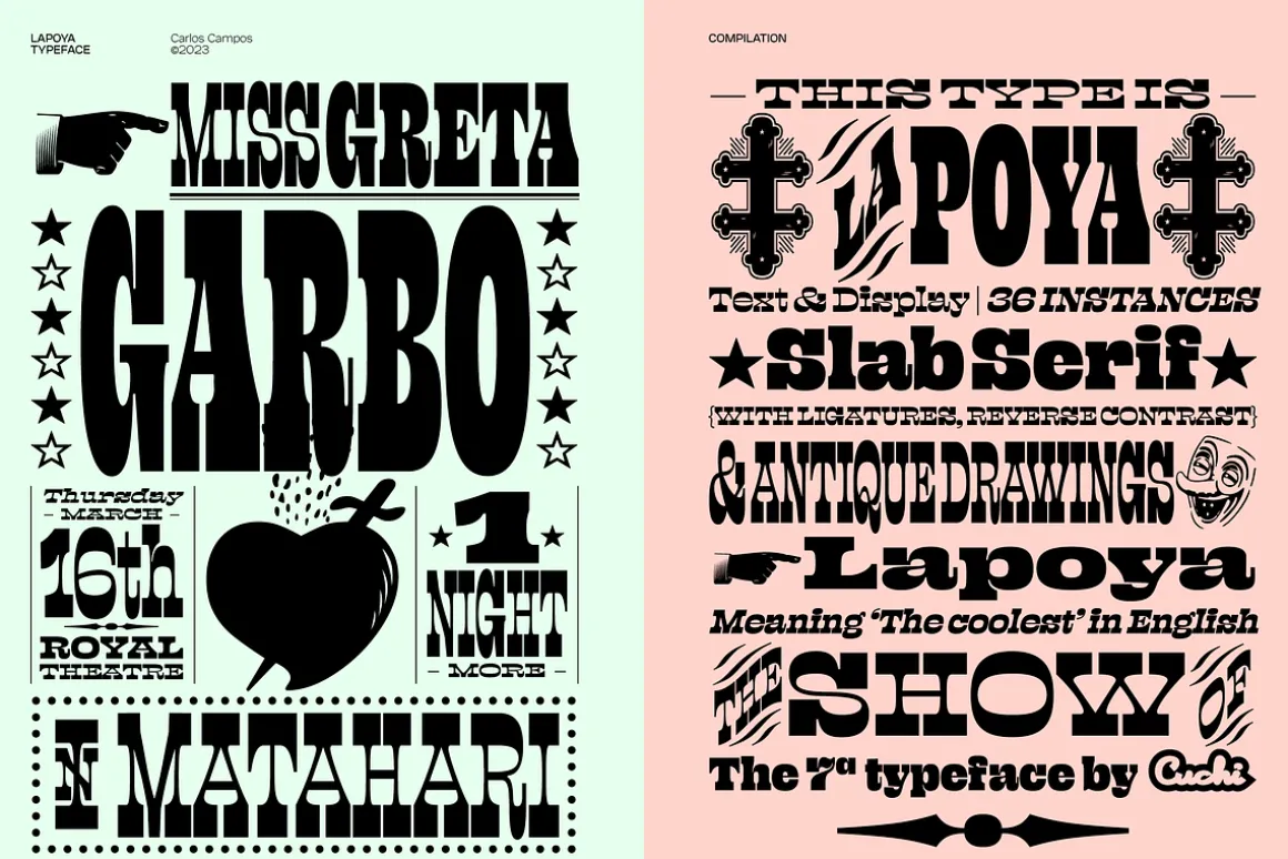
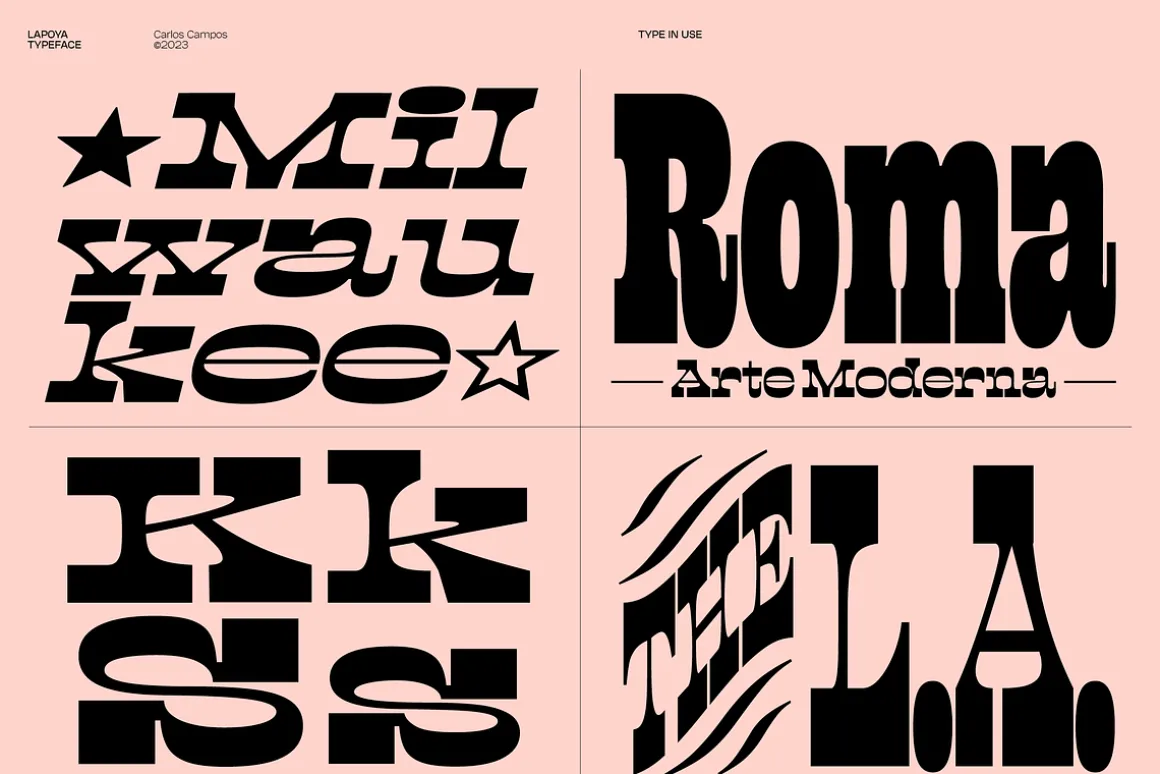
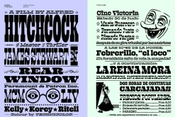
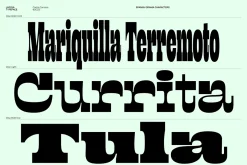
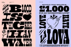
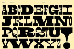
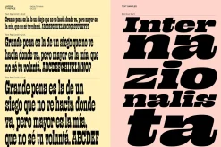
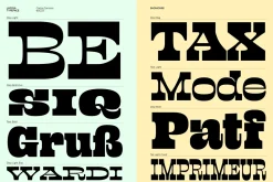
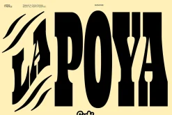
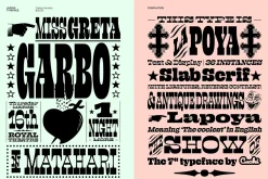
LAPOYA is a slab serif font designed by Carlos Campos (Cuchi, Qué Tipo!).
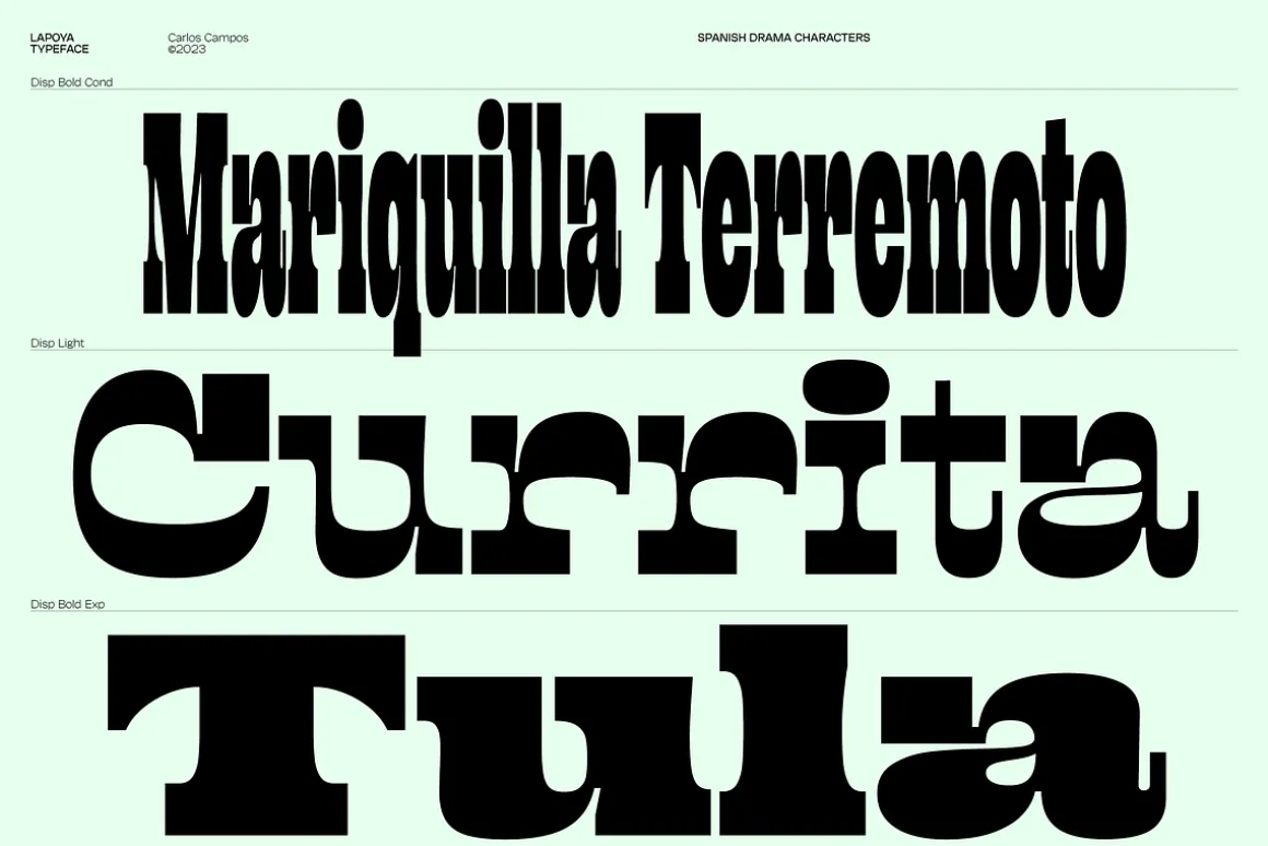
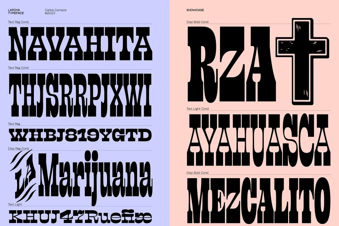
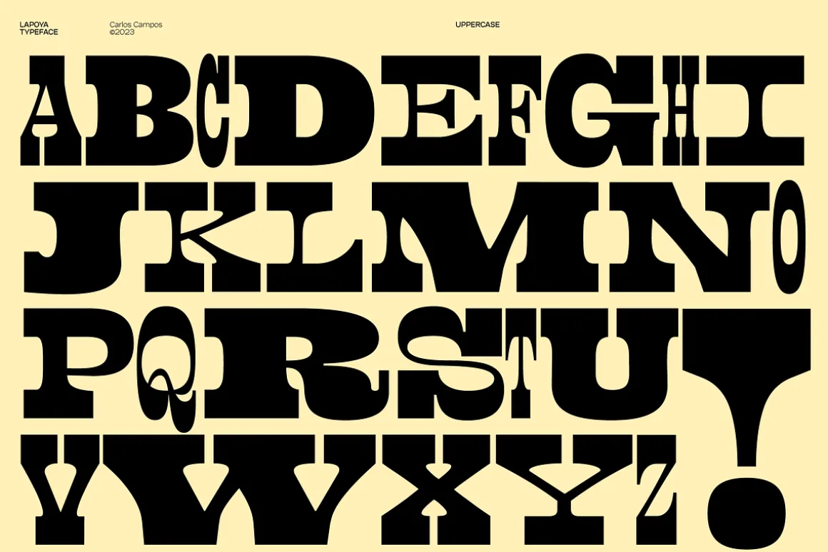
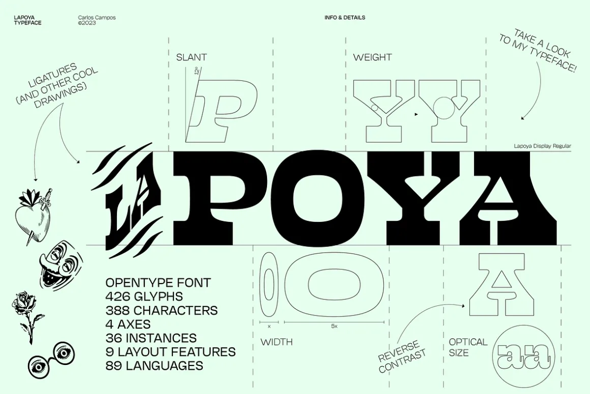
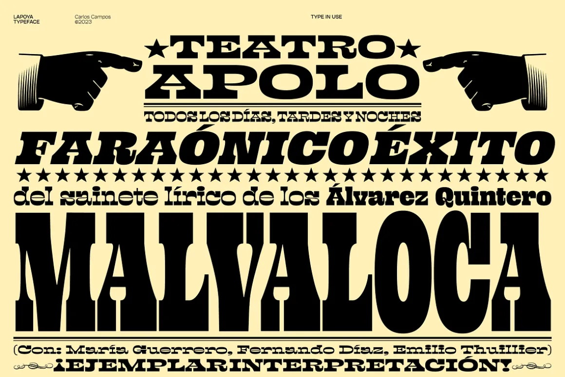
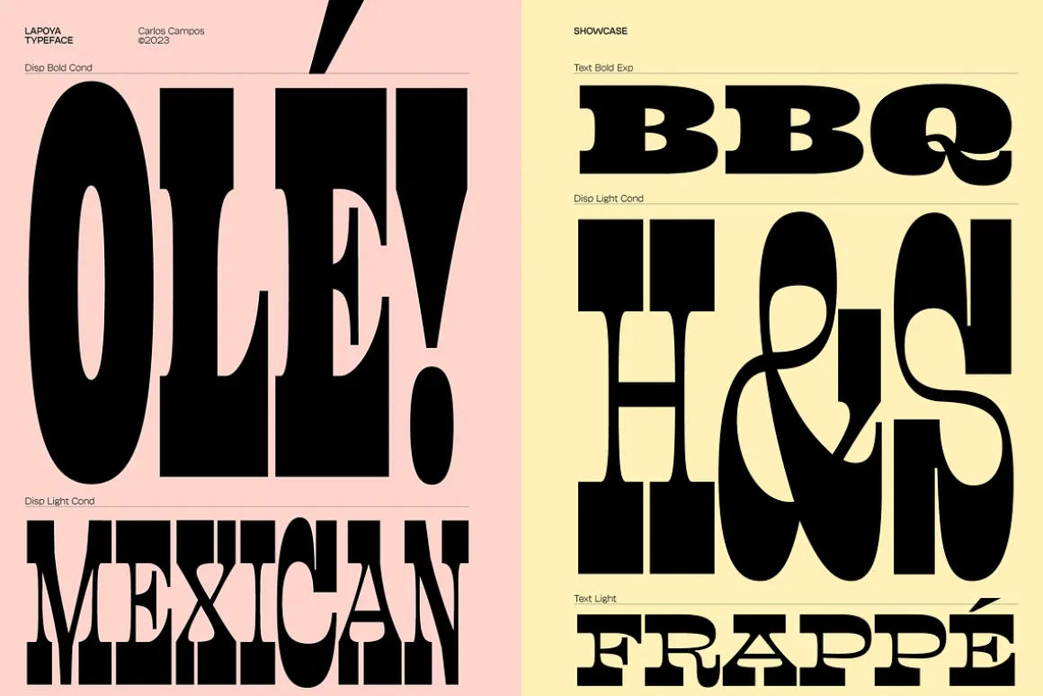
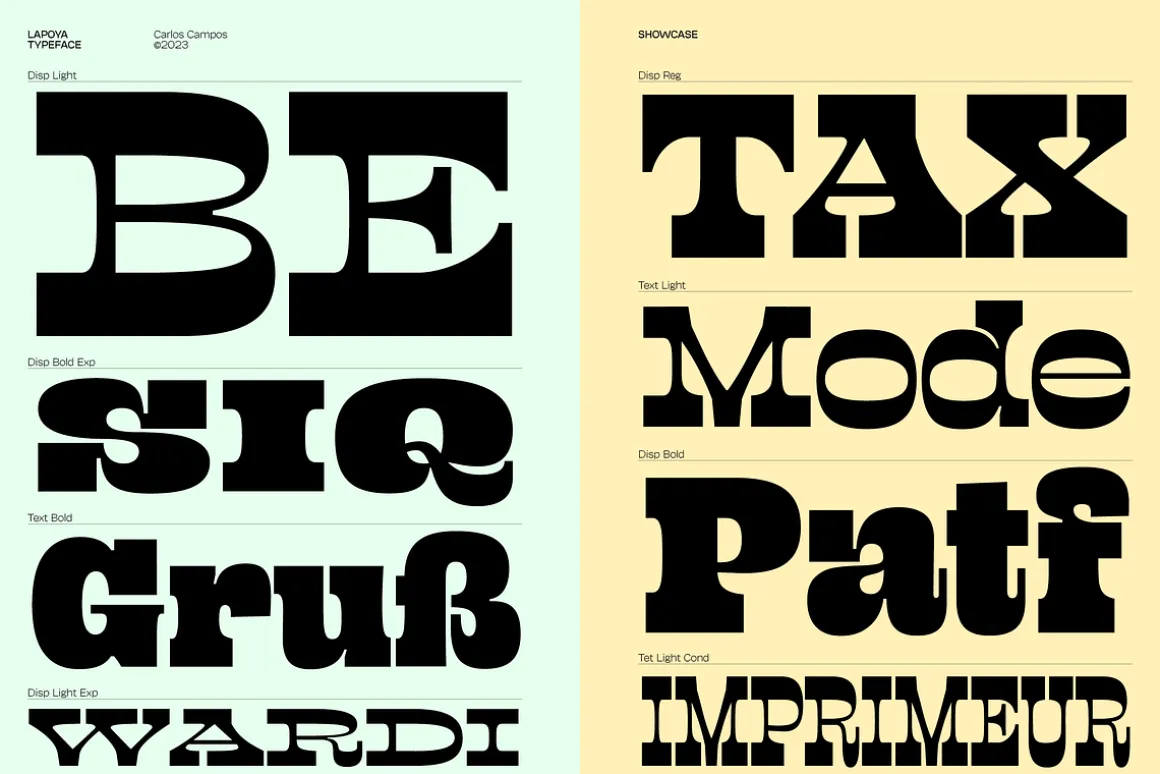
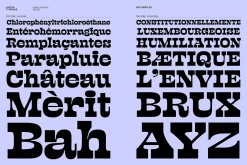
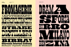
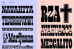
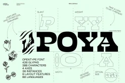
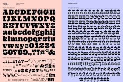
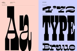
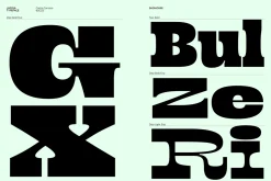
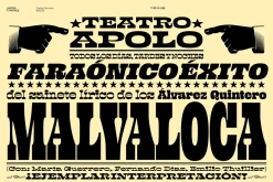
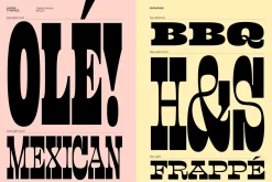
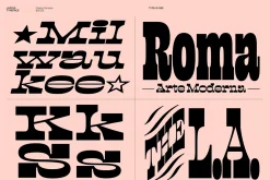
LAPOYA (meaning in spanish “the coolest”) is a large slab serif typeface family, with a certain Italian inverted contrast touch. Specially designed for advertising big shows and commerces, Lapoya has 36 variables and four axes, including a text and decorative versions, where the drawing and width of its counterforms vary. It is clearly inspired by the large wood types designed for posters, advertisements and newspapers. Since they were introduced in the 19th century, slab serifs have become extremely popular. In fact, serifs are often enlarged, not so much to look like beautiful or balanced letters, but to be more graphic and visual powerful than others. Furthermore, in the case of this typeface, this idea has been applied not only to capital letters, but also to the lowercase, numbers and signs of all kinds.“This typeface is LAPOYA!”
You can see more in
The download zip file of Lapoya typeface contains: OT, TT and VARIABLE FONT formats
426 Glyphs
388 Characters
89 Languages
4 Axes
36 Styles
9 Opentype features
Precise kerning
| Pick | App, Desktop, E-pub, Webfont |
|---|
Be the first to review “Lapoya Font”
Related products
Font Styles
Font Eras

Aesthetic Fonts

Aesthetic Fonts

Calligraphy

Font Eras
Font Eras
Font Styles


Elegant
Font Eras
Font Styles

Aesthetic Fonts
Aesthetic Fonts
Font Styles

Aesthetic Fonts
Reviews
There are no reviews yet.